Final - Oh Gypsy
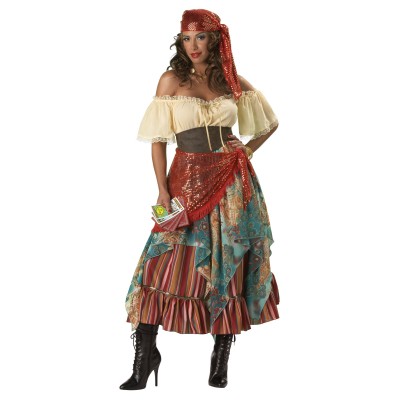
This final project was to take a choice song, and create four images that delt with the content and lyrics of the song.The song I chose was 'Oh Gypsy' by a band called Frenchy and the Punk, formerly known as The Gypsy Nomads. The song is done with an acoustic guitar, and hand drums. The lyrics talk of a young, Christian girl, who is waiting and wanting for a lover. She has waited so long, and can't stand it any more, so she goes to a Gypsy to see if she can user her powers of foresight to tell when when she will meet her forever lover. The Gypsy looks into her crystal ball, and sees only the girl, so she moves on to tarot cards, and the cards that are revealed to her, speak that the male lover the girl was seeking will never arrive, because her future lover, is the Gypsy herself.
I created the first image, knowing that a main part of the song is about the Gypsy, as the chorus is the girl pleading with the Gypsy to reveal the hidden secrets about her lover. The words 'Oh Gypsy' are the most repeated in the song, so I chose those words because of their importance. For the picture, I wanted to keep up the theme of lots of bright colours, as those are what follow Gypsys, so I took the colorful painting, and then messed with the hue/saturation, and burned and dodged a little. The black background was used to accent the bright colours.The second image I created knowing that a crystal ball would be a pretty obvious image for any viewer to recognize of an item that belonged to a Gypsy if I created it with type. I used the colors from the picture for the base, to make brassy/gold looking feet, and put the outer glow on the text that makes up the crystal ball to help it look more mystical and a little more solid without just making a massive amount of text (granted, I do have quite a bit as it is). I was also hoping to make it look a little... mesmorizing.
The first three images were created in Adobe Photoshop. For the first one, the background was created using a large, soft brush with bright colors. The text was simply typed up, and then warped. The faded layer was warped differently, and then the opacity lowered.For the second graphic, I put the Gypsy painting on a layer above the black background layer, and then put the text between them. While holding alt, I clicked between the two layers in the layer panel to create a Clipping Mask. Then on the painting layer, I went into Image > Adjustments > Hue/Saturation and used the burn and dodge tools.For the third image, I had a picture of a crystal ball on a stand. Using the ellipse tool, and clicking the 'path' option, I created a circular path around the main shape of the crystal ball. Using the text tool, I typed the line I wanted to make up the crystal ball, and copy-pasted until the circle was complete. I copyed that circle of text and shrunk it, and rotated it a little bit for every new layer of text creating the ball. Using the pen tool, I created the paths for the base, and then copy-pasted the text from the crystal ball.Finally, for the fourth image, this one created in Adobe Illustrator, I started with the white/purple circular gradient. Purple to me has always been a colour of Gypsys, since Hunchback of Notre Dame's character Esmeralda, so that's why I chose purple. Using the ellipse tool, and a one point stroke, I created the black circle outline, as if it was another crystal ball. Using a charcole brush tool, I created the whispy looking blue smoke lines. Chosing the important part of the repeated chorus, I used the Arc effect to make them follow the curve of the crystal ball, as if they were a part of the ball itself, and to create some dimention. The change of font was to link the word 'Gypsy' back to the first image (as it is the same font) and to accent the word 'love'. (Also, if you look in the middle of the ball, in the smoke, there are two abstract heart shapes in the smoke; that happened totally by accident.)

Five: Created in photoshop. I wanted to show a scene from the eyes of the girl walking up to the Gypsy for her fortune. I those three images; the background and caravan, the Gypsy, and the table with the ball and tarot cards. I saturated each image, and for the table, I warped and used the perspective tools so that it looked more in place. Image links from Google!TableGypsyCaravan
The illusion of motion is created in animation by the use of frames. Frames are, essentially, the same picture over and over, with small differences. When these frames are run one after another, like in a flip book, the object appears to be moving. In Photoshop, animation is created by the use of different layers having the different frame images, and then putting the correct image on the correct frame in the Window > Animation pallet.

For my animation, I started with the first frame image of the tribal wolf. On the second frame, I used the paintbrush to make the yellow strokes in the black of the eyes to make it appear as if the eyes were opening, and used a black paintbrush to shape the lips and teeth, to make it look like the mouth was opening. I then took the right paw, and put it onto it's own layer using the rectagle marquee and move tool, and gave it a white stroke using the effects window. On the next frame, I moved the paw up a little bit, using the rectangle marquee and move tools, and continued this, making a new frame each time I raised the paw, until it reached the height I wanted. After that, I rotated the paw to an angle, and lowered the paw, each time I moved it, making a new frame. As the paw lowered, I added in the red slash marks on their own layer so it appeared to be leaving claw marks on the screen. The black background and red 'A' were the next frame, the frame after that adding the word 'Wolf', and finally every letter of 'Production' as a new layer and new frame, to make it appear as if the word is actively being typed.
This cover design started with a black background. I wanted to do something with a shatter or broken/explosion effect, sort of like the cover from my Sophomore year, and was unsure of how to do it, so I looked through a few tutorials, and picked one that was a little different, but I still liked. The tutorial had a lot of steps, but was surprisingly simple. It starts with typing the text where you want it, and right-clicking on the layer and converting it to a smart object. Then you apply a layer mask and, with a black brush on the mask later, cover up some parts of the text. Using the render filter of clouds to add a little bit of texture was the next step, and then making a clipping mask between the Text Smart Object and the Smart Object clouds. Also clipped, I created a hue/saturation layer that was slightly blue, and a levels layer whos values are listed in the tutorial. On a new layer, with varying stroke sizes, I covered the text with white lines. Saving the lines as their own file, they were used as the source file for Filter > Distort > Displace. The small dots around the letters were made by using a white coloured custom-made brush, the settings in the tutorial, on a new layer. On another layer, more lines were created, but this time different shades of grey. These lines were also smudged a little, masked and attacked with a splatter brush like the text was in the beginning (values given in the tutorial) and were used for another Displace filter. In a new layer above that, the lines were covered by Cardnial and Gold with a large, soft brush. Holding alt and clicking between the lines and color layer made a clipping mask between these just like it did earlier with the Text Smart Object and clouds, coloring the lines where they were covered. Using the same 'bubble' brush as before, but larger and on a new layer, I added more of them around the words and logo. These were coloured using the same steps as colouring the lines, including the clipping mask (except for the ones that are white). For the RHS logo, I just repeated the steps involving the splatter brush masking (but with the bubble brush) and the steps involving the coloured bubbles. :3Tutorial Used
This one started as me wanting to do a cover that didn't have a black background. I chose Cardinal over Gold because I thought it would be the less painful to look at in a large amount. I knew i wanted to start with something that looked like the double 'R' logo, but was a little different, and searched around for the right font. Finding a font that looked similar, I found that the black of the letters sort of ran together too much for me to recognize them as two different 'R's. At first, I fixed this by adding a one point gold stroke around them. I liked how it made the edges where the letters overlapped stand out just enough for the viewer to see two 'R's and how they just stood out from the background. The last thing I did was to tilt them slightly, to create a more intresting look. The glow was added later so that they appeared to be above the cheer. On top of the background, I added a simple cheer that I have heard at football games douzens of times, hoping to show a bit of school spirit. I wanted something more then just the plain Cardnial background, and origonally had the text in a straight block. Thinking that it was actually too distracting like that, and a bit intimitating, I transformed it to a tilt in an attempt to contrast the tilt in the double 'R' and make it look less daunting. I chose a font that was more like handwriting to make it appear casual, or like a student wrote it. After that, I still decided that the design still looked just -too- plain. I thought that an image of the school would look really well and make a nice secondary focal point on the cover. I added a filter to it, and then burned the bushes and trees to highten the contrast in the photo. One of the final steps, was the Planner text. The black blended in too well with the photo, so I added the Gold stroke, as there was already a lot of Cardinal in the image. It was actually what gave me the idea to put the outer glow on the double 'R'. The official Double 'R' logo in the bottom corner was added as an afterthought to fill up a spot I thought was too empty and unbalanced.
Again, my cover started with a simple, plain black background. Using the text tool, I looked for a casual, simple looking font and placed the 'RHS' acronyms in opposing corners. From there, I placed the 'Student Planner', with a one point black stroke, and '2012-2013' text. I thought that all the white text looked too bold, so I lowered the opacity of the 'RHS' so it appeared more grey and less obvious. I then placed the Rider Double 'R' logo in the middle. I felt the design was simple, and liked that, but it still seemed a bit too boring. Taking a large, hard-edged brush, I randomly drew the Cardnial line, and then the Gold line. Finally, I added a filter over the lines to make the design just a little less plain, and give it more depth.
Rudy lives in a small, rural town with his Master, whom has no other pets. He lives for his Master, and is everything from a guard dog to a friend to him. However, he finds that sometimes, he longs to climb the highest mountains, and explore the vast fields that he has heard about from the other dogs of the town. Little does Rudy know, that he is actually part wolf, and the part that yearns for adventure is the blood of his wild ancestors.
The processed used in creating this character all started with an idea. A small, faint, vague idea of doing something with a wolf. I started in Adobe Photoshop, with a Wacom tablet, and a bright blue brush at about 20% opacity. Then I began to sketch. At first, I wasn't sure what I was going to do for a pose or facial expression, and they just came to me as I sketched. As I finished sketching, I created a new layer, turned my paintbrust black and 100% Opacity and traced my sketch on the new layer. From there, I saved it, and then took the file into Adobe Illustrator. Using the pencil tool, on a new layer, I traced the lineart from Photoshop, and used Illustrator's smooth tool to help smooth out the new lineart. When that was all finished, the file went back into Photoshop; the lineart now had a transparent background, and it was time to color. I started by clicking on the spaces I wanted to color on the 'lineart' layer, and then moved to the 'color' layer below that, and used the paint bucket to fill in the color. After all that was done, I went back around the edges of the lineart with a paintbrush of the correct color to fill in any extra white spaces that may have occured.
Explain how this collage is a self portrait of you.
I believe this is a self portrait of me because it encompases quite a bit of who I am. I am and always will be a creature of the wild, never to be tamed and enjoying freedom to it's fullest. I see the beauty in northen nature where others see only frozen wastelands and ruthless beasts. This picture holds small inklings to how my sprit and soul really are and feel, even if they are in a place that is nothing like where they wish to be. I am all about being who you really are, finding and portraying your true self, no matter what other people think.
Name the tools and techniques you used to create your raster self portrait collage.
Changed Opacity on Moon Layer; used 45 opacity eraser to remove hard edge. Soft Light Blending mode.
Changed sky color with color balance on bg layer, and then changed total BGs Color Balance to match moon picture.
Used eliptical marquee to surround wolf and face layers to remove excess and create 30px feathers
Used clone stamp tool on wolf to remove tracking collar.
Used quick select tool to select rock in foreground; cut, paste & + drop shadow
Pasted waterfall photo, used 45 opacity eraser to soften edges; used eyedropper to take color sample from BG layer and used Color Replacement brush to make waterfall have the same color hue as BG to blend with BG.
Burned trees on BG layer surrounding waterfall.
Pasted geese flying. Erase bg by hand, go over black birds (to darken) with black paint brush by locking layer transparency. Added small drop shadow. Used Layer > Matting > Defringe to remove excess white pixels.
Added two-tone gradient over entire picture to grey top of photo more and deepen the blue at the bottom. Lowered Opacity.
Added text with color from sky. Added drop shadow. Used Warp Text and adjusted Wave settings to make the words seem to fly away with the birds.
Explain the rule of thirds and how you used it in your raster self portrait collage.
For rule of thirds, the wolf is on the lower left quadrent. My picture is on the upper right intersection. The birds and text are focused in the upper left quadrent, and small parts of them flow into the upper middle.
Include your image links.
Migrating Geese
Wolf
Moon w/ sky
Waterfall
Mountains (Image 9)
Describe the look and feel of your font.
I named my font 'Blockeh 8-bit' because it sort of reminded me of the pixels used in things that are made in 8-bit. I kept my font pretty angled, and made negative spaces where two positive spaces met. For example, in the G every time two lines touch, there is a white space. I think you could use this for a body of text, but it might get a bit tiring to read. It's more likely to be used for a slogan or headline.
Explain the steps you took to create your font in Fontstruct.
I got into Fontstruct, and clicked 'Start Now' to get an account set up and to start creating my font. I chose the large black squares to do a basic straight line shape of all of the letters, and then went back to add in the white space blocks for wherever two lines came together.
Fontstruct


